As I have transformed my art practice from traditional mediums to digital art, I have found that selecting a printer is a lot like dating and alas, I have left behind me a trail of strained relationships.
Sometimes it’s ended after the first date, sometimes it’s been months.
It all began in Spring two years ago. I was young. Naïve.
Being self-taught and fiercely independent I still had so much to learn. But I knew one thing for sure: I wanted to make art.
I had been ‘playing’ with drawing digital for a few months and after visiting a market where an artist was selling their prints; I became captivated by their professional vibrancy, weight & texture.
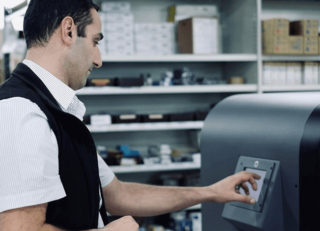
I decided it was time to try reproducing some of my digital art with the hope of making sales. Equipped with just a laser black and white printer at home, outsourcing was a no brainer.
So I did the first thing that came to my mind: I clicked a few buttons and ordered a colour document print on the thickest uncoated paper they had (300gsm) and then ducked down to everyone’s favourite office store.. let’s call him Mr O- to collect my prints the next day.
I was excited at first, smelling and touching my art, but the honeymoon period was brief. Something just didn’t sit right. The colour balance? The dancing outlines of edges? The flat sheen of the paper? The way they felt so… ordinary?
Sigh. This fling was not to be repeated – the old spark just wasn’t there. I needed to protect myself from disappointment and do some thinking.
My limited knowledge of printers at this point was that there’s inkjet and there’s laser printing. After reaching out to the store to try to understand what went wrong, the print manager informed me that my standard colour prints had been done with a laser printer.
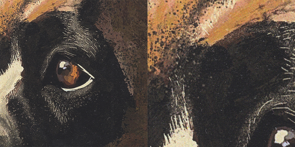
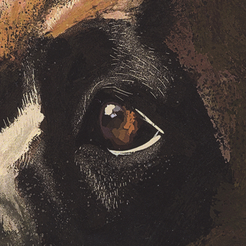
I have since found out what you probably already know – that laser printers are about speed and sharp lines (text) – they apply toner as dots on a low-resolution grid, while inkjet printers squirt colour onto the paper at a much higher resolution. You can see it very clearly when I scanned the print at a resolution of 1200.
My chat with an Inkjet printer revealed that they had a large format inkjet printer available for use, so I decided to give them a spin. I sent off the same high-resolution file and selected the same size but chose to have it printed as a ‘poster’ size
But to my utter disappointment, the heaviest paper weight available for this method of printing was 160gsm… I was hoping to replicate the thick prints I’d seen at the market which were at least 300gsm but oh well, I thought.. what have I got to lose?
I ducked to the store the next day to pick them up, a little bit nervous.
And oh! Much better! This time the colours actually meld and sing and are pretty much exactly where I want them. The detail is much improved…. errrgh, but that paper!! So thin, so plain.
As I hold it, I tilt it from side to side to get a sense of how light interacts with the surface – it’s so flat and chalky. Not that I wanted it to be glossy or sheeny, but it’s just missing SOMETHING.
Well, I could probably get away with framing this and giving it to Mum for Mother’s Day, but not for selling at a market. I want some texture! I want some weight!
This guy wasn’t going to last long. And as they say, communication is everything– so I picked up my phone..
Me: “Is there a thicker paper?”
Them: “No.”
Me: “Why not?”
Them: “It comes on rolls and that’s all we have.”
Me: “Oh okay. And while we’re chatting, I’m looking at printing these as art, how long will the colours last for?”
Them: “ They’ll start to fade at around 12-24 months so long as you keep it away from heat, sunlight and water.”
Me: “WHAT?! I’m hoping to sell these as art that goes on peoples’ walls for a LOT longer than that! Can’t you do better?!”
Them: “Nope. It’s because we use dye inks in our inkjet printer. It sounds like you’re after pigment-based inkjet printing.”
Me: “Ok… I’ll look into it, thanks.”
Slowly I found some answers on Google… so there’s dye based and there’s pigment ink-based inkjet printing.
Functionally, dye-based printing absorbs into the paper, while pigment inks are powdered pigment particles suspended in a fluid that is applied to sit on top of the paper.
Because pigment inks trap and protect colour inside a pigment, they can last from to 150 – 200 years in the right conditions while you’re lucky to push past 20 years of resisting colour fade with the best quality dye-based inks!
I did find out however that dye-based inks CAN look sharper and be reproduced quicker – but with such little shelf life it’s certainly NOT worth it for selling art.
Needless to say, he was dumped. So, I was looking for an Australian printer that used pigment-based inkjet printing on thick (at least 300gsm) slightly textured paper.
After spending a few hours trawling through the internet I narrowed down a shortlist. Price was my deciding factor… who could print an A4 fine art print on 300gsm cotton rag the cheapest?
Finally, I decided on a printer that was interstate but ticked all of my boxes. They even did print-by-demand and drop shipping – not yet something I needed but something I wanted as an option in the future.
So I jumped on their (somewhat archaic) website and sent away for a trial print using the same image as before. As I waited, I decided on an assessment scale using these four tests…
· Printing test 1 : Colour accuracy rating x/10
· Printing test 2 : Edges accuracy rating x/10
· Paper test 1 : Paper texture & weight x/10
· Paper test 2 : How light falls on the paper x/10
When it arrived a couple of weeks later (yikes!), it looked and felt great! A shining 40/40. It had depth of colour, fine detail, subtle texture, weight.
The light even glimmered slightly as I tilted it from side to side. Yes. It was just like those prints I’d seen at the market.
So I ordered more. Urgh but that website was starting to bother me. And it was the only way for them to receive orders! So restrictive, I sensed I’d be stifled in my growth if I stayed with them.
On top of that, it was difficult to get into contact with them to troubleshoot or scheme. Sure, they had the looks but the communication was a fizz. And they were slooow and so far away – I’d never meet them! This long-distance relationship was not going to work.
So, my eye started wondering and I turned my gaze elsewhere.
That’s when I met Mr C. There was a spark there, and he was so willing to work with me. I had to email my orders through directly, but that gave me so much freedom.
He was even willing to order paper in for me or let me provide my own sourced paper to fit in with my fussy requests. He was willing to do trial prints with me in the shop and work with me until I was happy.
He gave me advice on colours calibrating my screen at home. He stocked a variety of 100% natural archival heavy fine art papers. He could go big. And his pricing was right on point.

Through this journey I’ve learned so many other things which I’ll be sharing with you down the track, such as:
· how to identify a good pigment-based inkjet printer
· what type of paper slows the rate of colour fade in fine art prints
· what other materials can have pigment-based printing applied to them
· working out when I can use the term ‘Giclee’ for my prints
· the importance of calibrating the colours in my monitor
· the importance of my printer calibrating their hardware per paper type (that’s monitors and printers calibrated for each different paper type because all papers have a different white point).
There’s a lot to this game, and although I think I know enough to get by now I’m glad I have a printer who knows a lot more than me!
“Em Shannon is a Melbourne based digital artist with interests also in acrylic and watercolour painting. She loves to push boundaries of mediums and experiment with fresh combinations such as watercolours and digital art.
Flowers, succulents, clouds, birds, and found treasures she encounters while walking the school run are her muse. You might also occasionally catch her sketching on her iPad in a café. Her repertoire of limited-edition prints can be found online at https://www.emshannonart.com/”