A Passion for Providing Quality in Printing

Contact Us
✖

    The Artists’ Definitive Guide to Printing (pt. 2)

    Today our journey takes a dramatic ascent into some nerdy digital imaging specs where we’ll be picking our way through terms such as screen calibration, colour correction, ICC profiles and colour gamut. For those of us squinting in confusion at these odd words on the screen, they simply refer to processes of colour management.

    Greetings again arty types! So, a quick recap on our information exploits in The Artists’ Definitive Guide to Printing (pt 1) we discussed the rudiments of identifying a good fine art/ digital printing service, provided some pointers on how to communicate and build good relationship with your Printer and then dipped our toes into some techy details in determining whether scanning or printing is best for your particular artwork.

    Today our journey takes a dramatic ascent into some nerdy digital imaging specs where we’ll be picking our way through terms such as screen calibration, colour correction, ICC profiles and colour gamut. For those of us squinting in confusion at these odd words on the screen, they simply refer to processes of colour management.


    But how exactly does one manage colour?

    Great question! Glad you asked Before discussing the how, lets define the why – in other words, the goal of colour management, which is to match colours across display or print views regardless of the brand or type of camera, computer monitor, scanner or printed materials of the same image.

    Colour Management
    Colour management is a quality-control process to ensure the fidelity, consistency and predictability of digital colour. So; what’s involved in colour management and how do you go about choosing the correct colour values?

    Friends, the straight-up answer is, this is based on in-depth knowledge and experience and because colour preferences are quite subjective, it can be a very involved consultative exercise between a professional Printing Technician and the artist. So yes, if you want to leave it in the hands of the experts to undertake the extensive colour correction and record-keeping it takes to guarantee a colour match on reproduction prints then you may want to skip this part.

    However, if you do want to know the basics so you can geek out with your Printing Technician or even ensure you’ve got the best possible set up of your own equipment to understand the fine art printing process and produce a more efficient end product, read on:

    Several elements make up colour management, starting with colour profiles, which define the colours captured on a camera and viewable on screen displays. Colour profiles control the colours that are available to be used (see colour gamut below) and help provide consistency between devices.
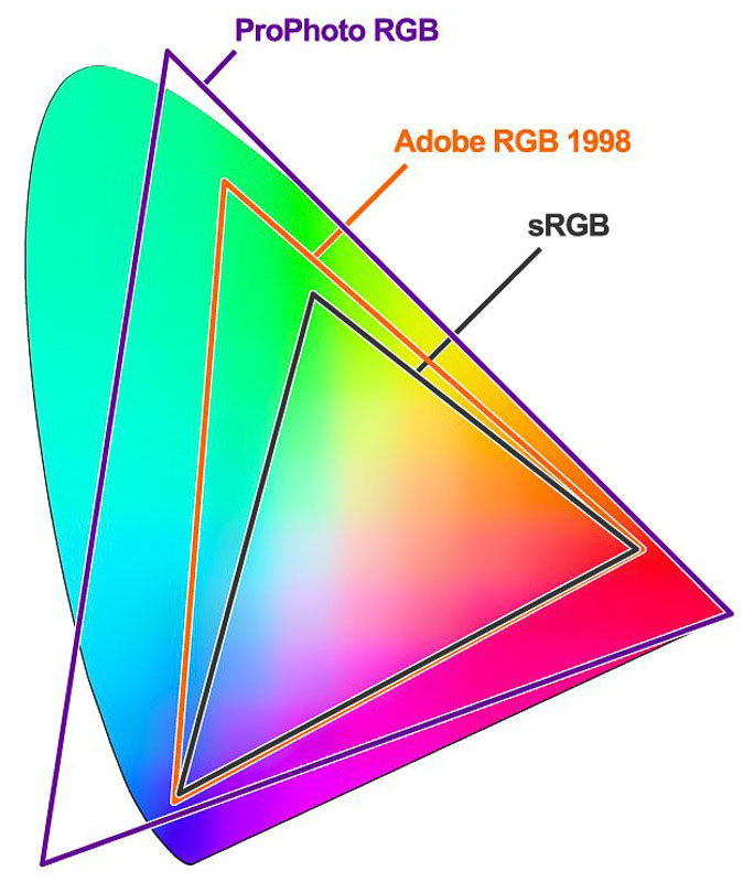
    Colour gamut
    Colour gamut refers to the spectrum of colours that an electronic display can accurately reproduce on-screen and is at the mercy of the optical properties of a device’s display architecture. To break it down: the larger or wider the gamut, the richer and more saturated the colours available

    Fun fact: the term “the full gamut” has entered western lexicon to describe the whole range of a particular thing, but it originated from the medieval Latin term gamma ut; the name of the lowest musical note in the medieval scale


    Colour profile management


    The higher the range of colours in the visible colour spectrum (or gamut), the closer you will get to accurate colour. Adobe RGB and ProPhoto RGB are the industry standard for photo editing and printing, but to really get the best results, shooting your artwork in RAW format and saving as a TIFF file will not only provide you with optimal results but give you (or your printing specialist) full creative control over post-production and your end product.

    Screen Calibration
    The vast majority of computer screens are not calibrated (which there is a whole science behind) but basically, screens project light and are designed to be vibrant, so what you see on your screen is rarely what the print will look like.


    Essential to accurate colour management is the creation of a colour profile to maintain a consistent colour across the evolution of your image from the image capture, transfer to a monitor and eventual hardcopy reproduction via a printer.
     
    But without your screen, camera or printing device being hardware colour-calibrated, how do you even start a discussion about correct colour values with your Printing Technician? What foundation do you start from to ensure the colours in your art (or imagination) will translate to the Printers high-tech equipment? But without your screen, camera or printing device being hardware colour-calibrated, how do you even start a discussion about correct colour values with your Printing Technician? What foundation do you start from to ensure the colours in your art (or imagination) will translate to the Printers high-tech equipment?
     
    Considering the sheer scope of image-capturing devices, brands, operating systems and image editing software currently available on the market, you could be excused for being overwhelmed with how colour management is even possible across these platforms.

    Enter ICC: developed by Apple; a vendor-neutral, cross-platform colour management system, enabling standardised colour space mapping between the source and target outputs. In other words, universal calibration; or the process of altering the colour response across devices to wrangle accurate corrections to improve the gamma, white point and colour accuracy of your screen for consistently accurate colour reproduction to your desired surface.

    Now at version 4 (v4), ICC is a basic -but essential- way of accurately setting your displays colours without requiring specialised hardware and a Windows version is available, called ICM (Image Colour Management).

    You can download ICC/ ICM files for different displays from either the manufacturer’s website for your specific display model or web search your device model + “colour profile” and implant that to your colour settings via “ColorSync Utility” – Mac or “Color Management” – Windows.

    Et voila. The magic sauce of maintaining colour consistency throughout the image capture and preparation processes.

     
    Colour Correction
    However, while this may assist you in providing a more accurately calibrated screen for your home system, to really pimp your profile prowess, the use of spectrophotometer for screen calibration is the only way to maintain your colour management system all the way through the capture to print process.
     
    Uhh.. a spectro – what??
     

    A spectrophotometer is a really, really expensive piece of hardware that you can set unique colour profiles to work across various camera/lens combinations, device monitor/s and printer/s.

     
    But here’s the bad news, folks: printing industry standard spectrometers start from around the $4000 mark if they’re going to be worth the investment in any type of calibration management system. But look, if think laterally you may find a pro photography club that offers hardware sharing services so you don’t have to cough up the dough.
     
    Our recommendation though? Work with a fine printing service that are not experts in their field but have invested into state-of-the-art equipment that will ensure you end up with the perfect colour profile and quality prints every time.
     
     
    A full-service art printing company can repurpose the archived master file in whatever form you need and working with an experienced and competent Printer will allow you to view your proof alongside the Printing Technician where they will provide you with printed test strips of your work for proofing.
     
    To understand how the digitisation process works here at Creffield, check out our blog Digitising your artwork: how does it work (and is it any good)? or get in touch with one of our expert Consultants.

    Stay tuned for part three of The Artists’ Definitive Guide to Printing where we’ll discover that not all inks are made equal, and the ways that RGB printers are a game-changer for giclee and fine art printing!

    Contact Us